Why Does This App Feel So Easy to Use? The Gestalt Principles Behind Great UX
Gestalt Theory, based on the psychological principle that "the whole is greater than the sum of its parts," explains how humans perceive and organize visual information. In the realm of UX design, Gestalt principles offer a framework for creating intuitive, aesthetically pleasing, and user-centered interfaces that reduce cognitive overload and guide user attention naturally.
Gestalt principles help designers structure content in a way that feels instinctively logical to users, improving usability, readability, and interaction efficiency.
Gestalt Theory: A Brief Historical Background
Gestalt psychology originated in early 20th-century Germany, spearheaded by psychologists Max Wertheimer, Wolfgang Köhler, and Kurt Koffka. These pioneers proposed that people naturally perceive entire structures rather than isolated parts.
Max Wertheimer formalized the theory in 1912 with his observation of the phi phenomenon—a visual illusion where stationary images presented in quick succession appear to move. This became the foundation of motion pictures and digital displays. Köhler emphasized problem-solving through holistic insight, while Koffka popularized the theory with the statement, “The whole is other than the sum of its parts.”
Proximity Principle
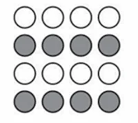
Proximity refers to the human tendency to perceive objects that are close to each other as related or grouped. In UX, this principle is vital for grouping related items visually.
For example:
- In e-commerce product cards, placing the product name, price, and "Add to Cart" button close together helps users quickly understand their relationship.
- In form design, grouping fields like "First Name" and "Last Name" under the same visual block improves scannability and reduces friction.
Similarity Principle
This principle states that elements that share visual characteristics (like shape, color, or size) are perceived as related.
In UX design:
- Uniform button colors for the same function (e.g., all green for “submit”) help users develop intuitive habits.
- In social apps, using the same circular frame for all profile images helps users recognize people more quickly.
Continuation Principle
Users tend to follow lines or curves, perceiving them as continuous paths.
Applied examples include:
- Landing pages designed with a vertical scroll flow that reveals new sections as the user progresses downward.
- Product sliders on retail websites that align horizontally encourage natural left-to-right browsing.
Closure Principle
Closure describes the mind’s ability to fill in missing information to perceive complete forms.
In real-life applications:
- Logos with intentionally missing parts still convey the full brand identity (e.g., WWF’s panda).
- Loading indicators that form incomplete circles are still understood as full shapes, keeping users engaged without overwhelming them.
Common Fate Principle
This principle refers to elements moving in the same direction being perceived as part of a group.
UX examples include:
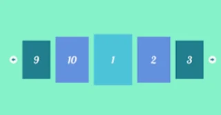
- Carousel images sliding together in the same direction give users a sense of grouped content.
- Animated loading bars where elements move simultaneously indicate progression and unity.
Symmetry Principle
Humans perceive symmetrical designs as stable and visually appealing. Symmetry also aids in navigation and comfort.
Examples:
- Layouts that balance content evenly on both sides of a screen feel organized.
- Symmetrical button placement (e.g., “Next” and “Back” buttons) aids usability and reduces cognitive load.
Figure-Ground Principle
This principle explains how users distinguish between foreground elements (important) and the background (context).
Applications:
- Product photos with a sharp foreground and a blurred background enhance focus.
- Hero sections of websites often display a central image (the figure) against a minimal background to draw attention.
Why Gestalt Matters in UX
Effective UX design isn’t just about making something look good; it's about ensuring users understand and navigate it effortlessly. Gestalt principles provide scientifically-backed guidelines that align with human perception, making interfaces more intuitive.
By applying these principles, designers can:
- Reduce user errors
- Improve task efficiency
- Increase engagement
- Enhance overall satisfaction
Ultimately, Gestalt theory bridges the gap between psychology and design. It enables UX professionals to create environments where users don’t have to think about how to interact—they just do, naturally.


